
Ellsworth Kelly, Meschers, 1951
COLOR AND SHAPE: A LOOK AT ELLSWORTH KELLY, BY CAROLYN PORRAS
In 1964 Clement
Greenberg coined the title “Post- Painterly Abstraction” for an exhibition
where a new style of art was being shown in response to Abstract Expressionism.[1]
The most distinct difference to this prior movement was that it was heading
towards a new linear clarity rather than a painterly approach. Abstract
Expressionism believed in gesture and history within their paintings. [2]
In contrast Post- Painterly Abstraction artists believed this layering of
gestures showed too much individuality and were determined to create clarity
and expansiveness. There were 31 artists included in this exhibition including
Frank Stella, Helen Frankenthaler and Ellsworth Kelly. Post- Painterly
Abstraction was most known for t use of vibrant colors and thick paint, yet
there were several styles under the umbrella of Post- Painterly Abstraction.
Color-field
painting was a part of this movement and artists such as Frankenthaler and
Rothko participated in it. This sub style practiced large expanses of
unmediated color. The hues were painted side by side in order to create a
visual and emotional experience. Louis and Noland were involved in another Post- Painterly
style, which was the Washington Color School.[3]
They rejected visible brushstrokes
and focused mainly on experiments of color to avoid the visibility of their
hand. Hard edge paintings were also an important part of this movement. One artist in particular showcased how flat
colored shapes were used to transform perception and experience.
Ellsworth Kelly
was creating during the Post- Painterly Abstraction movement. He was born in
Newburgh, New York on May 31, 1923.[4]
In 1943 he was inducted into the United States Army, and for his return to the
United States he moved to Boston and used his G.I Bill for tuition to attend
the School of the Museum of Fine Arts.
His works are
known for showcasing his unique way of seeing. He takes cues from his surroundings and transforms them into
flat geometric shapes. Kelly engaged intensely with perception and transforming
this experience.[5] These shapes may seem random and
unassociated with our natural surroundings however he drew great inspiration
from nature. It was said by
Bernstein that when Kelly observed his drawings from decades ago he would
recall the memories associated with making them. His memories of a bird or a
beetle teach him about color and shapes that play into his paintings. Inspiration from nature extended to
more than just insects and trees, he was inspired by shapes in architecture,
floor tiles, or broken glass. In Diane Waldman’s essay on Ellsworth Kelly’s
work she quotes him on his art process
“I like to work
from things that I see whether they’re man-made or natural or a combination of
the two. Once in a while I work directly from something I’ve seen, like a
window, or a fragment of a piece of architecture or someone’s legs; or sometimes
the spaces between things, or just how the shadows of an object would look.”
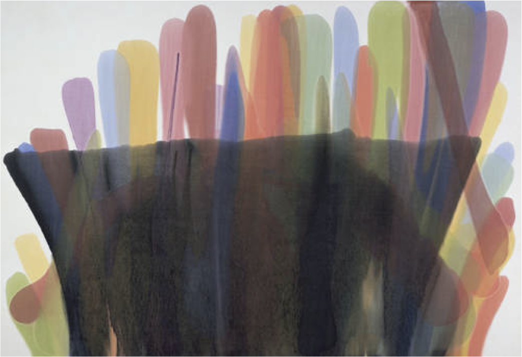
An example of this
transformation is his painting Meschers
from 1951. Meschers gives that broken
glass feel, it was constructed by slicing a drawing into 25 squares and
rearranging them at random into a collage that was used as inspiration for this
painting. Meschers is 59 x 59 inches[6]
and resides in a private collection. This piece is segmented into five blue
vertical parts with stark green horizontal lines cutting through them. The
colors sit next to each other but it seems like the green is floating atop the
blue.
The title Meschers alludes to a village near the
river called Meschers. This makes the viewer come to the conclusion that
inspiration was his observation of the water, sky and trees. Suddenly the fractured blue and greens
take on a new meaning and representation. The green shapes recall sharp blades
of grass and the blue could be the sky or water along the bank. Advancing this “reality” by suggesting a
new one intrigued Kelly.
This method of
working can also be compared to one his collages, Spectrum Colors Arranged by Chance. This is a series of eight collages that is made up of 1,600
squares. These squares were sourced from reflections of light on the Seine. He
used a grid format just as in Meschers and
used chanced to place the colors. This causes that fragmentation and
abstraction. Both these paintings despite their abstraction resonate with
perception and indicators of his transformation of reality.
Kelly developed a
process for these collage series. His memory and engagement with his natural
surroundings accumulated in his mind to create a stock of images he could rifle
through. These images of patterns, colors and negative spaces between buildings
were his resources. From then he would paint, or draw with these memories in
mind. Since he was recalling his memory the images already transformed from
actuality. Continuing his process of abstraction he would then cut the drawings
and rearrange them into a new abstract composition with an echo of the reality.
Kelly had no system or conditions to which he bound this process he just
created through chance.[7]
“This way of
composing was endless and didn’t need ‘me’- they made themselves-it seemed
nature worked for me using the laws of chance”[8]
The last step was
to enlarge the collages into a flat painting. Or even several paintings that he
would then connect. Since there were all these steps into making the works that
we all know today, what is left is something completely foreign.
Ellsworth Kelly
was a very minimal painter in the time of Post- Painterly abstraction. His goal
was like many others before him, which was to perceive reality. But his works
such as Mescher proves that he was
driven by color and shape in order to display his sense of “reality” and
nature.

Friedel Dzubas, Patmos, 1958

Kenneth Noland, Askew, 1958
KENNETH NOLAND'S ASKEW, BY EVA MOSLEY
“What
sets the best Color Field paintings apart is the extraordinary economy of means
with which they manage not only to engage our feelings but also to ravish the
eye” (Wilkin 17). These provoking words from Karen Wilkin somewhat epitomizes
the subject of Color Field Painting. In this sense, it is meant to directly
question what art really is through the bold overlapping colors used in this
subgenre of Post Painterly Abstraction. Color Field removes the traditional
subject from the painting and transforms color into the subject itself. One of
the artists associated with this painting style is Kenneth Noland, an American
painter and sculptor who used his G.I. Bill from his service in the US Air
Force to study at the Black Mountain College in North Carolina (“Noland” 1).
His painting Askew from 1958 proves
to be a stunning contribution to the style of Color Field Painting.
Noland
was very good friends with fellow painter and color field artist Morris Louis,
who taught with him at the Black Mountain College. Here they met Helen
Frankenthaler. Both Noland and Louis were influenced by Frankenthaler’s
staining method and took a trip to New York to visit various galleries where they
saw more of her works (Wilkin 31). What Noland chose to focus on and found to
be a provocative subject was the circle. He described how “both eyes focus on
it. It stamps itself out like a dot. This, in turn, causes one’s vision to
spread, as in Tantric art” (Wilkin 40). Askew
embodies his fascination with the concentric shape. Having been painted in
1958, Michael Fried, a well-known art critic, after seeing his works, comments
on how 1958 was when Noland really broke out into his truly mature style (Fried
60). In size, the painting measures out to be 67 1/8 by 69 inches and is
located at the Mitchell-Innes & Nash Museum in New York City.
In this painting, we can see the influence and
similarities between Mondrian and Noland. Askew
exhibits a clarity that is classic, and the chromatic cessation of the space
and how there is a sort of optical illusion that seems to retreat and advance
but at the same time is still occupying one plane. This painting pulls your
eyes to look towards the center through the contrast of the black in the center
and the comparatively lighter colors that fan out from the middle. However,
what Noland accomplishes in his paintings, and in Askew in particular, is to “convey a physical sense of space with
expressive brushwork, staining, overlapping edges and the illusion of
diminishing forms created by concentric bands of color” (Noland and Waldman
11).
If you
compare Askew to his later works you
can see how the theme of concentric circles is still clearly present but has
taken on a more defined edge. Drawing from Frankenthaler and Pollock, Askew is made by the staining of an
unmeasured canvas, which leaves a design on the canvas that seems almost
magically placed with no marks left behind through the use of paint brushes. Noland
uses Magna paint, which is a brand of paint specifically used for the
suspension of the paint in the use of solvents. This allows for the paint to
completely fuse with the canvas. The staining process stays true to the
minimalist ideal of the artist of the Post-Painterly Abstraction movement—-having
as little personal influence on the piece as possible. This feature is one that
defines Noland as a color field artist and as a part of the Post-Painterly
Abstraction movement. Fried praised Noland’s work as having “succeeded in
constructing a color-situation of great optical force” (Fried 62).
In the exhibit in the Mitchell-Innes and Nash
Museum, the painting sits on the wall only a few feet above the floor, which
leaves the viewer looking straight into the black dot in the center of the
painting. The black ring and circle in the center of the painting seem almost
sinister in comparison to the lighter outer rings. The painting, being almost
six square feet, is pretty large and just stares you right in the face. Also,
the contrast of the circular painting with the square frame is aesthetically
pleasing. This really plays a trick on the eye, like those optical illusions
that pulls the eye into the painting and draws it to the center but also lets the
eye expand outward from the center to take in the whole painting of concentric
rings that appear to be splattered onto the canvas. When looking at it, it is
clear how flat the painting is, but at the same time appears to have depth.
Ultimately, what Noland was trying to convey
through Askew was to make the viewer
stop and think about what they were looking at. With the bright colors that
grab the attention of the onlooker, and the circular shapes drawing them in
deeper into the painting. It accomplishes a sort of perfect imperfection with
its use of the circular geometric shape, but having it seemingly splotched onto
the canvas is really beautiful. Noland’s circular themed paintings are
treasures in and of themselves and hold all the passion of the artist who
created them. “Noland’s paintings are declarative without being declamatory,
lucid but never obvious. They are charged with feeling and possessed of an
experiential richness far in excess of their visible means” (Fried 63).

Barnett Newman, Untitled, 1959
Morris Louis, Floral V, 1959-60

Mark Rothko, No. 64 [Untitled], 1960

Mark Rothko, No. 16, 1958

Hans Hofmann, The Gate, 1959-60

Morris Louis, Beta Lambda, 1960

Morris Louis, Alpha, 1960
Kenneth Noland, Earthen Bound, 1960

Willem do Kooning, A Tree in Naples, 1960

Morris Louis, Alpha Epsilon, 1961

Kenneth Noland, Turnsole, 1961

Sam Francis, Blue Balls VII, 1962

Jules Olitski, Cleopatra Flesh, 1962
ON JULES OLITSKI, CLEOPATRA FLESH, BY LESLIE HOWARD
Clement Greenburg has written, “The ultimate effect sought is one of an almost literal openness that embraces and absorbs color in the act of being created by it. Color field has to be uniform in hue, with only the subtlest variations of value if any at all, and spread over an absolutely, not merely relatively, large area. Size guarantees the purity as well as the intensity needed to suggest indeterminate space: more blue simply being bluer than less blue.”
Olitski’s relevance within Post-painterly Abstraction of Art lies in his yearning for transcendence and the infinite. He has abandoned all suggestions of figuration and instead has investigated the relevance and exploration of color. This is especially true in the large field of color within an artwork. It has avoided the suggestion of form or mass, more concerned with the color as a field. This artwork is more associated with the works of Hard-Edge Painting due to the autonomous shapes and color field painting. One does not get the census of gestural abstraction, which instead evokes the stained quality of Cleopatra Flesh. Hard-edge abstraction involves the departure of expressiveness and gestural abstraction, scene in Olitski’s work. There is a fullness of color, and clear execution of form along with smooth surface planes. Olitski may not be as geometric or “hard-edge” as other hard-edge abstraction painters, such as Ellsworth Kelly, Frank Stella, and Kenneth Noland. Cleopatra Flesh is a characteristic of the hard-edge painting in that its lines are virtually very clean, the areas are recognizably very geometric and it is a flat surface.
The artwork is between perception and the purely visual character of the thing perceived (Fried, 36). This visual character is a particular color-situation. He makes us encounter these colors, making us view them more intensely, by experiencing individual colors, without subject, regardless of form, just color. The handling of color is crucial to opticality. Opticality, first and foremost is executed through color, and then followed by medium (Fried, 37). We are able to recognize these colors because they are different from the bare canvas, immediately we notice the higher key of color, the brightness of blue, black and red.
He uses the technique of staining in which thin pigment was soaked through the canvas fabric, and not lying idly on the surface, in large-scale erratic circular shapes (Moffet, 9). The stained canvas evokes density and fullness, without thick textural techniques of impasto or dripping of paint onto the canvas. Dying his canvas with acrylic resin paint yielded the true and original construction of color-situations that he ambitioned. Staining produced a continuous flatness. It was through staining that he could create large and pure segments of high-keyed color, uninhibited by exploitative resources. There was no such figuration for which the colors to become, therefore taking on the purely aesthetic color quality, limited to certain shapes, but not limited to the square.
In Cleopatra Flesh, we are first confronted with the deep, encapsulating blue image. This oblong blue structure is of circular dimension and nearly encloses the large black circle and smaller red circle. By constructing colors, he confronts us with three individual colors. There is a definite tension between them, on the brink of intense confrontation. Tension was not achieved only through the relationships of the shapes themselves, but through the pressure and counter-pressure exerted by the placement of the circles against one another and the blank background (Millard). The black and red circles are totally contained within the borders of the composition. There is nearly no overlapping of colors or shapes. They are very much individual in color and shape. There are serious tensions in color and spatiation. It would seem the artwork is organized around a core, but it is not centrally organized. The black and red circles are on the verge of being consumed by blue. This is intentional. The colors and contours are played off against one another at extremely close quarters, leaving narrow, pinched oscillating strips of blank canvas between them (Fried, 38). The colors and shapes retain their individual identities. The exclusion of overlapping and alignment with the rectilinear frame emphasizes the irregularity of exclusively rounded forms (Moffett, 9).
The circumference of the blue circle exceeds the canvas’ limits. A flood of color rolls downward from the top right of the canvas, nearly encompasses the black circle, and begins to surround the red circle as well. This gives a very eccentric and lopsided design in composition, and yet it has achieved a high equilibrium of shapes and colors. The vastness of the blue circle and monumentality of scale coincides with the enormous canvas. Also, the logic of stain is much more aligned with opticality than practicality of shape and form. However, Olitski is still able to maintain control over the body of the shapes, pushing their dimensions to capacity just before they collide. Each shape is juxtaposed against one another. Because the blue is ever expanding, but has not been able to attain the two other circles completely, the smaller circles remain freed from the constraints of containment.
The individual color-elements appear to consume their contours (Fried, 38). The large canvas was a perfect medium to simplify the procedure of his paintings for an aerial pungency to his high-keyed, uninflected colors (Hilton, 57). The cropping of the canvas resulted in an eccentric and lopsided design. The top and right side of the blue circle was cutoff, resulting in exclusively rounded forms within a rectangular frame, and no longer organized around a central core. Olitski drove both the optical and the configuration to extreme limits in this artwork.
It seems a bit obvious to evoke the characteristic of flatness of surface within Olitski’s painting, although it is one standard of Color-field painting. It is flat. And yet that is not the immediate focus that one gains from glaring onto its surface. The immediate evocation is the color, the colors that are immediate in representation: the blue, black and red. In contrast, in tension with this work is the background canvas, which is such an irrelevant but clear factor in the work. Literally, it is a hard-edge painting in that the lines are so distinct to form the object, there are unquestionable lines making up the presence of contort. One sees the field of color, represented quite literally in blue, black and red.

Kenneth Noland, Drought, 1962

Gene Davis, Untitled, 1962

Howard Mehring, Double Red, 1963

Helen Frankenthaler, Canal, 1963

John Hoyland, 8.8.63

John Ferren, Dance, 1962

Howard Mehring, The Key, 1963

Jack Bush; Red, Green, Brown, 1964

Jules Olitski, Turkey Girl, 1964

Ellsworth Kelly, Red/Blue, 1964

Frank Stella, Fez, 1964

Gene Davis, Black Grey Beat, 1964

Jules Olitski, Shoot, 1965

Josef Albers, Hommage au Carre, 1965

Barnett Newman, Who's Afraid of Red, Yellow, and Blue?, 1966

Frank Stella, Harran II, 1967
FRANK STELLA'S HARRAN II, BY JENN DILLON
Beginning in the early 1950’s, a shift took place within the world
of art, mainly within the school of abstract expressionism. Critics and artists
alike sought to avoid the painterly, repeated, and empty stylistic devices of
some of the new members to the school of abstract expressionism. Out of this desire to
escape the painterly, loose definition of contour as well as color, some
artists began to react with sharp, uninterrupted, and segmented areas and
definition of contour and color. This new motive was described by Clement
Greenberg in his essay that accompanied the original exhibition of these works
(1). This tendency in art, which seems to have begun in the early 1950’s
and extended into the mid 1970’s, and can be referred to as Post-Painterly
Abstraction, a term coined by Greenburg in 1964 as the title of an exhibition
that he was chosen to curate at the Los Angeles County Museum of
Art. Post-Painterly abstraction can be better understood as a term that
includes a range of, some slightly and some drastically, differing styles
including color field painting, hard-edge paining, Washington Color School
painting, shaped canvas painting, and the like (2).
Shaped
canvas painting is a technique as well as a style of painting that existed
within the realm of Post-Painterly Abstraction. This form of abstraction was
readily popular and utilized throughout the 1960’s as what seemed to be a brand
new and literal combination of painting and sculpture. As the name implies,
shaped canvas is a painting that is not composed on the traditional square or
rectangle shaped canvas but instead on an irregular shaped one. The style of
Shaped Canvas Painting is not only just an element of Post-Painterly
Abstraction, but instead exists to make very interesting claims about illusion
as well as space on its own (3).
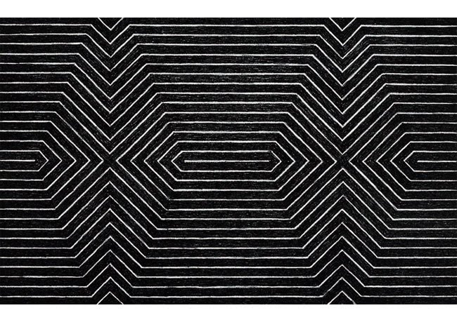
Frank Stella Created the work Harran II (1967), and other such shaped canvas works, as if in
an effort to break away from the constraints of the strictly framed and tight
canvas. Instead Stella strove to use a shaped canvas as a literal depiction of
figure, as opposed to merely representing it, which then in turn created a new
kind of illusion within the realm of painting.
When
looking at the impact and voice that shaped canvas pieces where attempting to
display, the work Harran II (1967)
seems to possess much of the characteristic rhetoric. The use of polymer and
fluorescent polymer paint on its own demonstrates a desire to utilize some of
the new materials as well as ideas of the time. Separate, blocked out, solid,
and consistent lines of color, typical of the non painterly, meet together at a
point to form geometric shapes and patterns that seems to draw the eye from the
top left corner down a maze to the bottom right of this extraordinary piece. Harran II (1967) is a composition
consisting of a large circle that is formed through the almost meticulous
combination of the perfect angles which were constructed with the help of
protractor devices. Circulating bands of color create “rainbow” like ribbons
that all come together to form the edges of the canvas. This composition of
shape together with the new technology of the florescent paint that was used come
together to form a work of art that has its very own lyrical capacity as well
as decorative quality (4).
There
seems to be a common theme within shaped canvas paintings and that is the
desire to create a literal representation of shape and form, as opposed to a
simple drawing or depiction of that form. Harran II (1967) combines arches and angles to create movement
and a whole new kind of illusion within painting. This piece could in a way be
considered a sculpture that could be hung from a wall. In this way, Frank
Stella seems to cast away the conception of illusionistic space and instead
captures space outside the constrictions of the normal rectangular or square
shaped canvas.Harran II (1967)
represents a relatively high degree of technical accomplishment within the
realm of painting not only when speaking of the medium and material of which it
was produced, but also when considering the composition of angles and space.
Frank
Stella has had a major influence within the art world throughout his entire
career and his contributions to shaped canvas painting and post-painterly
abstraction are numerable. In works such as Harran II (1967) Frank Stella escaped the traditional
conventions of canvas painting and uses florescent color on a carved out plain
creating his own space and creating a literal illusion within painting.

Frank Stella, Itata, 1967
Frank Stella, Turkish Mambo, 1967

Ellsworth Kelly, Yellow-Orange, 1968

Paul Feeley, Ochus, 1969

Nicholas Krushenick, Zig Zag, 1970

Mark Rothko, Chapel, 1971
THE ROTHKO CHAPEL, BY MIRELLA MARDAKIS
“A picture lives by companionship, expanding and quickening in the eyes of the sensitive observer. It dies by the same token. It is therefore a risky and unfeeling act to send it out into the world. How often it must be permanently impaired by the eyes of the vulgar and the cruelty of the impotent who would extend the affliction universally!” (Hess 42). Mark Rothko, during the late period of his artistic career, became increasingly protective of his artwork, perceiving his pieces as pathways to spiritual enlightenment and religious exultation. This attitude resulted in the completion of what is now known as the Rothko Chapel in Houston, Texas. Though he rejected all labels applied to his style, contemporary and modern art critics have and continue to label Rothko as one of the most prominent painters of the abstract expressionism movement of the mid-twentieth century. He channeled his style to complete, as Dominique de Menil himself has dubbed, “the greatest religious monument of his time” (Nodelman 9).
Rothko was approached by Mrs. Dominique de Menil on April 17, 1964, to produce a set of paintings to adorn the interior of a proposed chapel that was to be built for the University of St. Thomas. The project was commissioned by Dominique and John de Menil, two ardent patrons of art in Texas. By the 1960s, Rothko had rejected his previous affiliations with surrealism and mythological inspirations, turning instead to religious inspiration and use of primitive color. Only a few years previously, Rothko had withdrawn from the Seagram commission after working on the paintings for two years. Dominique and John de Menil were so impressed by the Seagram paintings that they even proposed buying the paintings to use in the chapel, an idea that Rothko refused. Yet the artist determinedly agreed to begin a new series of pieces for the chapel (Nodelman 33-34).
The chapel itself was initially designed by renowned American architect Philip Johnson, and later finished by Howard Barnstone and Eugene Aubry, as a small, octagonal structure. Rothko welcomed the project all the more enthusiastically because, for the first time in his career, he would have complete control in creating and arranging a suit of paintings to his liking. Beginning in the 1940s, Rothko had turned extreme and meticulous attention to the display of his art. He dictated specifications such as “hanging height, the intervals between and juxtapositions of paintings, the placement of paintings within the architectural features of an interior, the color of the wall surface upon which pictures would be seen, and more importantly, the character and strength of the lighting” (Nodelman 35). Throughout the fifties and up until the end of his life in 1970, Rothko had exhibited his works in a variety of museums and galleries and been given several commissions, such as the Harvard paintings from 1961 to 1964. Despite the flexibility and accommodations afforded to him as a result of his growing influence and prominence as an avant-garde artist, most of his exhibitions and commissioned works were eventually moved and changed to positions not originally intended. Some of his works were placed in interiors with distractions that detracted from the overall experience, such as “the distraction of views through doorways…Goldwater, for example, commented on how at the MoMA retrospective, the rooms containing paintings of a related palette were disrupted by the unavoidable glimpse of a dissonant work in another room” (Clearwater 158).
The chapel eradicated the problem of doorway interference and peripheral distraction by its compact, octagonal, single-room design. The viewer is presented with the fourteen paintings in a “‘wraparound’ viewing situation overtly centered upon the observer” (Clearwater 158). The viewer “is drawn in to an experience of the immensity of nature, an experience that has distinctly religious connotations” (Edwards). The chapel was, finally, an architecture designed explicitly to accommodate Rothko’s genius.
Upon first glance, viewers might confuse the paintings for a series of monochromatic works. Rothko relied primarily on dark red, mulberry, dark purple, and black in all of the pieces. The viewer must stare at each single piece to discern the different shades. This initial perception is difficult at first to achieve, “but this enhanced attention is not instantaneous in its results: the eye must acclimatize to the abnormally low value range before it can draw the fine discrimination upon which all depends. The moment of viewing is dilated in time and the process itself forced towards conscious awareness” (Nodelman 175). In several of the paintings, a darker rectangle forms a border, shrinking and expanding the perspective of the paintings. Rothko also made use of the white wall of the chapel as “the framing element that modulates the atmospheric colour” (Clearwater 160).
The original intention was to assign the chapel to the Roman Catholic faith, though nowadays it holds no denomination. However, critics have questioned Rothko’s use of dark colors in such a religious space. He told Dominique de Menil that during his visit to the twelfth-century basilica of Santa Maria Assunta on the island of Torcello he became fascinated with the juxtaposition of the foreboding Last Judgment at one of the basilica and the delicate Epiphany of Virgin and Child on the opposing apse. To capture this dichotomy of love and damnation, Rothko juxtaposed a large black painting at the entrance to his chapel with the triptych at the opposing apse, which middle panel was “slightly lighter, with a hint of pink” (Nodelman 9). The religious influences in the chapel are subtle and completely dependent on the viewer to find them. In fact, as many critics gather, the chapel’s main purpose is to coax the unconscious to light, to force the viewer to search. In “the existential allegory of the Rothko Chapel,” David Antin comes full circle with his philosophical train of thought to state that “there's nothing obvious about the chapel which is what makes it so effective its an uncompromising difficult and secular work…but if you try to experience it offers you a confrontation with the existential condition that ultimately characterizes our experience in the world” (Phillips and Crow 133).

Helen Frankenthaler, Nepenthe, 1972

Kenneth Noland, Following Sea, 1974

Anselm Kiefer, Keliogabal, 1974

John Hoyland, Pemba 24.4, 1977
Bibliography and Works Cited
Curatorial Statement
[1] Greenberg, Clement. "Post Painterly Abstraction." Sharecom Industries Ltd. Web. 02 Feb. 2012. <http://www.sharecom.ca/greenberg/ppaessay.html>.
[2] "The Art Story: Post-Painterly Abstraction Movement." The Art Story: Modern Art Movements, Artists, Ideas and Topics. Web. 02 Feb. 2012. http://www.theartstory.org/movement-post-painterly-abstraction.htm.
[3] Fried, Michael. 1978. Three American painters, Kenneth Noland, Jules Olitski, Frank Stella: Fogg Art Museum, 21 April-30 May 1965. New York: Garland Pub. Co.
[4] Wilkin, Karen. 2007. Notes on color field painting. Vol. 26, https://search.ebscohost.com/login.aspx?direct=true&db=aft&AN=505234514&site=ehost-live.
[5] Colpitt, Frances. "The Shape of Painting in the 1960s." Art Journal 50.1 (1991): 52-56. JSTOR. Web. 30 Feb. 2012. <http://www.jstor.org/stable/777086
[6] Geldzahler, Henry. 1990. Jules Oltiski. Salander-O’Reilly Galleries, Inc.
[7] Moffett, Kenworth. 1973. Jules Olitski. Museum of Fine Arts, Boston.
[8] Nodelman, Sheldon. The Rothko Chapel Paintings: Origins, Structures, Meaning. Austin: University of Texas Press, 1997.
[9] The Museum of Fine Arts, Houston, "Revelation: Major Paintings by Jules Olitski." Accessed April 12, 2012. http://www.mfah.org/site_media/uploads/attachments/2012-03-28/Exhibition_Wall_Text.pdf.
Ellsworth Kelly, by Carolyn Porras
[1] Anna Moszynska, Post-painterly Abstraction, Grove Art Online, http://www.oxfordartonline.com/subscriber/article/grove/art/T069007 (March 29, 2010).
[2] Wilkin, Karen. "Notes on Color Field painting." New Criterion 26, no. 2 (October 2007): 44-48. Art Full Text (H.W. Wilson), (March 29, 2012).
[3] Rose, Barbara. 2007. "Color Me Washington." Art & Antiques 30, no. 5: 56-61. Art Full Text (H.W. Wilson), EBSCOhost(accessed March 29, 2012).http://www.blogger.com/blogger.g?blogID=6112452060540495743
[4] Diane Waldman, Ellsworth Kelly: A Retrospective, ed. Diane Waldman (New York, New York: Guggenheim Museum Publications, 1996).
[5] Roberta Bernstein, "Red Green Blue: Distallations of Memory in Ellsworth Kelly's Art," Ellsworth Kelly: Red Green Blue, 2002: 20.
[6] Ibid, 2002: 20.
[7] Diane Waldman, "Ellsworth Kelly," Ellsworth Kelly: A Retrospective (Guggenheim Museum Publications), 1996: 19.
[8] Ibid, 1996: 21.
Kenneth Noland, by Eva Mosley
[1] Fried, Michael. "Hover by Kenneth Noland." Acquisitions (Fogg Art Museum).1964 (1964): pp. 60-63. Web.
[2] Noland, Kenneth, and Diane Waldman. Kenneth Noland a Retrospective. New York: Solomon R. Guggenheim Museum, 1977. Print.
[3] "Noland, Kenneth." Grove Art Online. Oxford Art Online. 28 Mar. 2012 <http://www.oxfordartonline.com.lp.hscl.ufl.edu/subscriber/article/grove/art/T062677>. Web.
[4] Wilkin, Karen 1940-, et al. Color as Field: American Painting, 1950-1975 / Karen Wilkin; with an Essay by Carl Belz. New York: New Haven: American Federation of Arts; in association with Yale University Press, 2007. Print.
Jules Olitski, by Leslie Howard
[1] Fried, Michael. 1978. Three American painters, Kenneth Noland, Jules Olitski, Frank Stella: Fogg Art Museum, 21 April-30 May 1965. New York: Garland Pub. Co.
[2] Geldzahler, Henry. 1990. Jules Oltiski. Salander-O’Reilly Galleries, Inc.
[3] Moffett, Kenworth. 1973. Jules Olitski. Museum of Fine Arts, Boston.
[4] Olitski, Jules, and Charles Millard. 1988. Jules Olitski: stained paintings 1961-1964 : [exhibition] April 9 to 30, 1988. New York: André Emmerich Gallery.
Frank Stella, by Jenn Dillon
[1] Greenberg, Clement. "Post Painterly Abstraction." Sharecom Industries Ltd. <http://www.sharecom.ca/greenberg/ppaessay.html>. Accessed February 2, 2012.
[2] The Art Story: Modern Art Movements, Artists, Ideas and Topics. "The Art Story: Post-Painterly Abstraction Movement."http://www.theartstory.org/movement-post-painterly-abstraction.htm. Accessed February 2, 2012.
[3] Colpitt, Frances, "The Shape of Painting in the 1960s," Art Journal 50.1 (1991): 52-56, accessed February 30, 2012,<http://www.jstor.org/stable/777086>.
[4] Avgikos, Jan, "Guggenheim," Collection Online, accessed February 5, 2012, <http://www.guggenheim.org/new-york/collections/collection-online/show-full/piece/?search=Frank Stella>.
[5] Harran II, 1967. Polymer and fluorescent polymer paint on canvas, 10 x 20 feet (304.8 x 609.6 cm). Solomon R. Guggenheim Museum, New York, Gift, Mr. Irving Blum 82.2976. © 2012 Frank Stella/Artists Rights Society (ARS), New York. (Artwork)
Mark Rothko, by Mirella Mardakis
[1] Clearwater, Bonnie. The Rothko Book. London: Tate Publishing, 2006.
[2] Edwards, David. "Mark Rothko: Forever Sublime." The Blurb. N.p., n.d. Web. 28 Mar 2012. <http://www.theblurb.com.au/Issue29/Rothko.htm>.
[3] Hess, Barbara. Abstract Expressionism. Los Angeles: Taschen America LLC, 2005. 42.
[4] Nodelman, Sheldon. The Rothko Chapel Paintings: Origins, Structures, Meaning. Austin: University of Texas Press, 1997.
[5] Phillips, Glenn, and Thomas Crow. Seeing Rothko. Los Angeles: Getty Publications, 2005.
No comments:
Post a Comment